Wouldn’t you want to know everything about your favorite classic cocktail?
Layout Design.
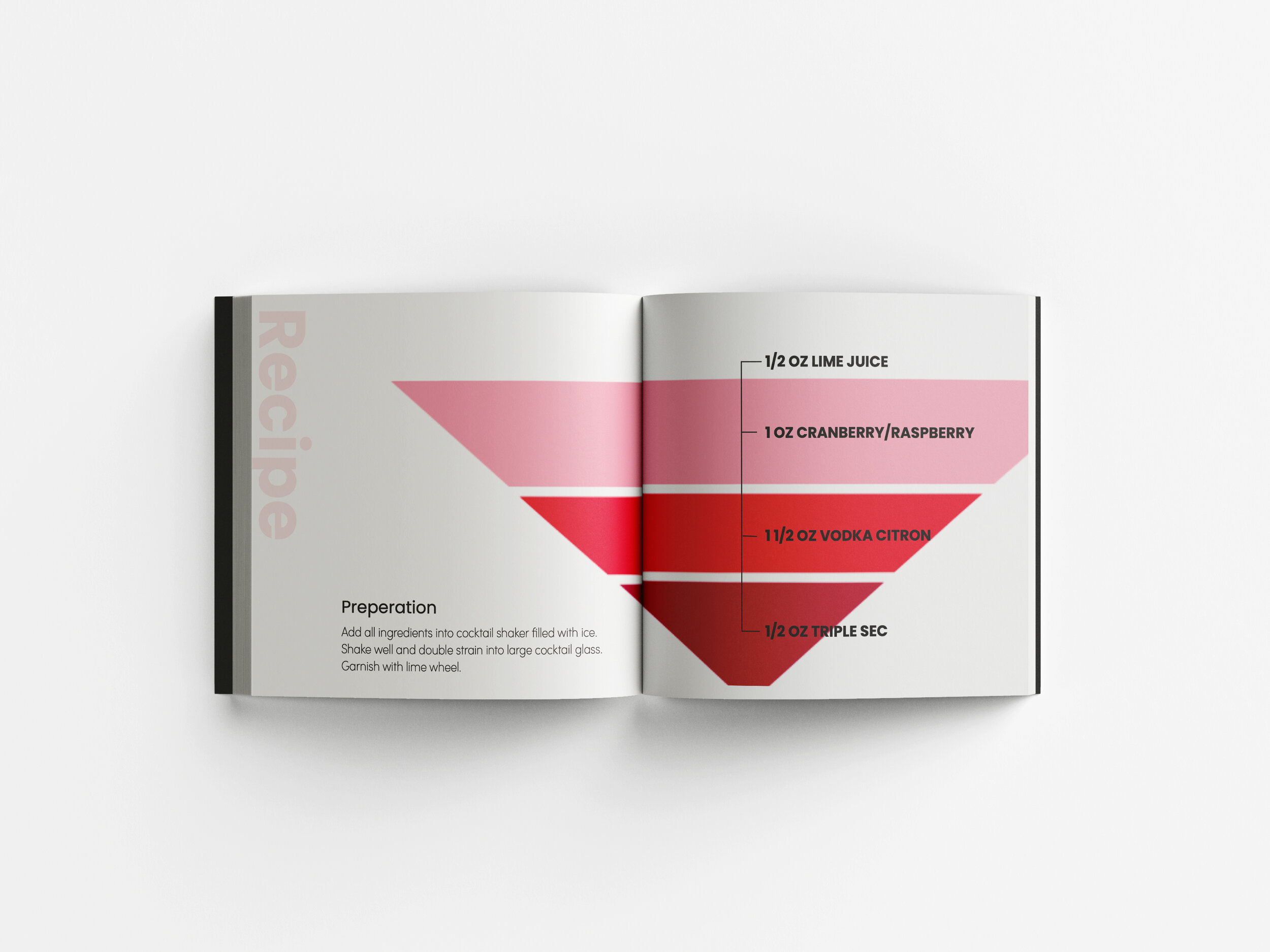
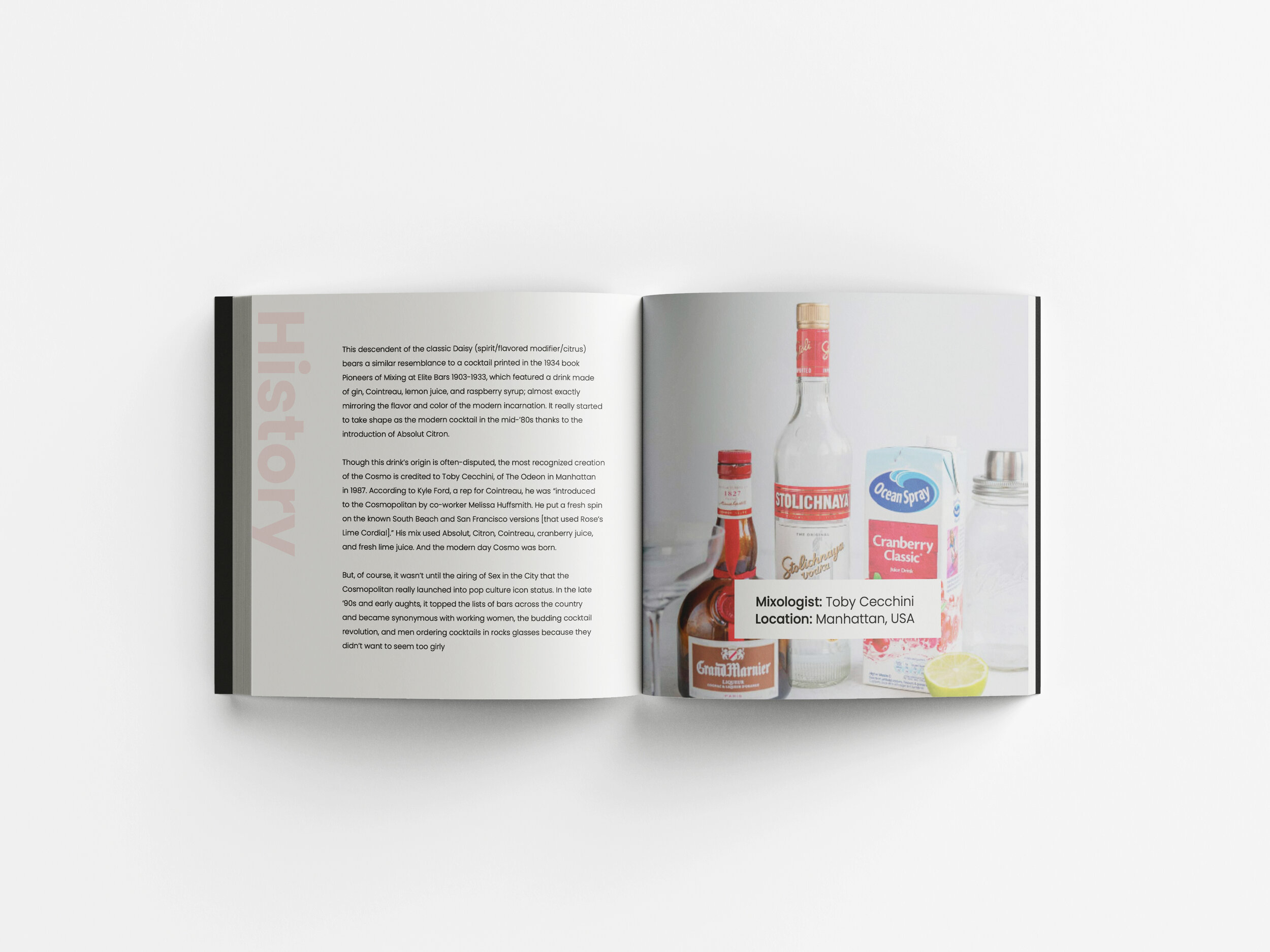
Created a more simplified realistic layout. For the first page it has, of course, a well photographed photo of each of the cocktails listed. I have only three examples to show because I wanted to exemplify the variety of color that is closest to the realistic color of each cocktail, as well as the shape of the original glass. Gradient of each color, light opacity of titles, shape usage, and typography was used to create this.


