
It all begins with an idea. Maybe you want to launch a business. Maybe you want to turn a hobby into something more. Or maybe you have a creative project to share with the world. Whatever it is, the way you tell your story online can make all the difference.
Logo Design
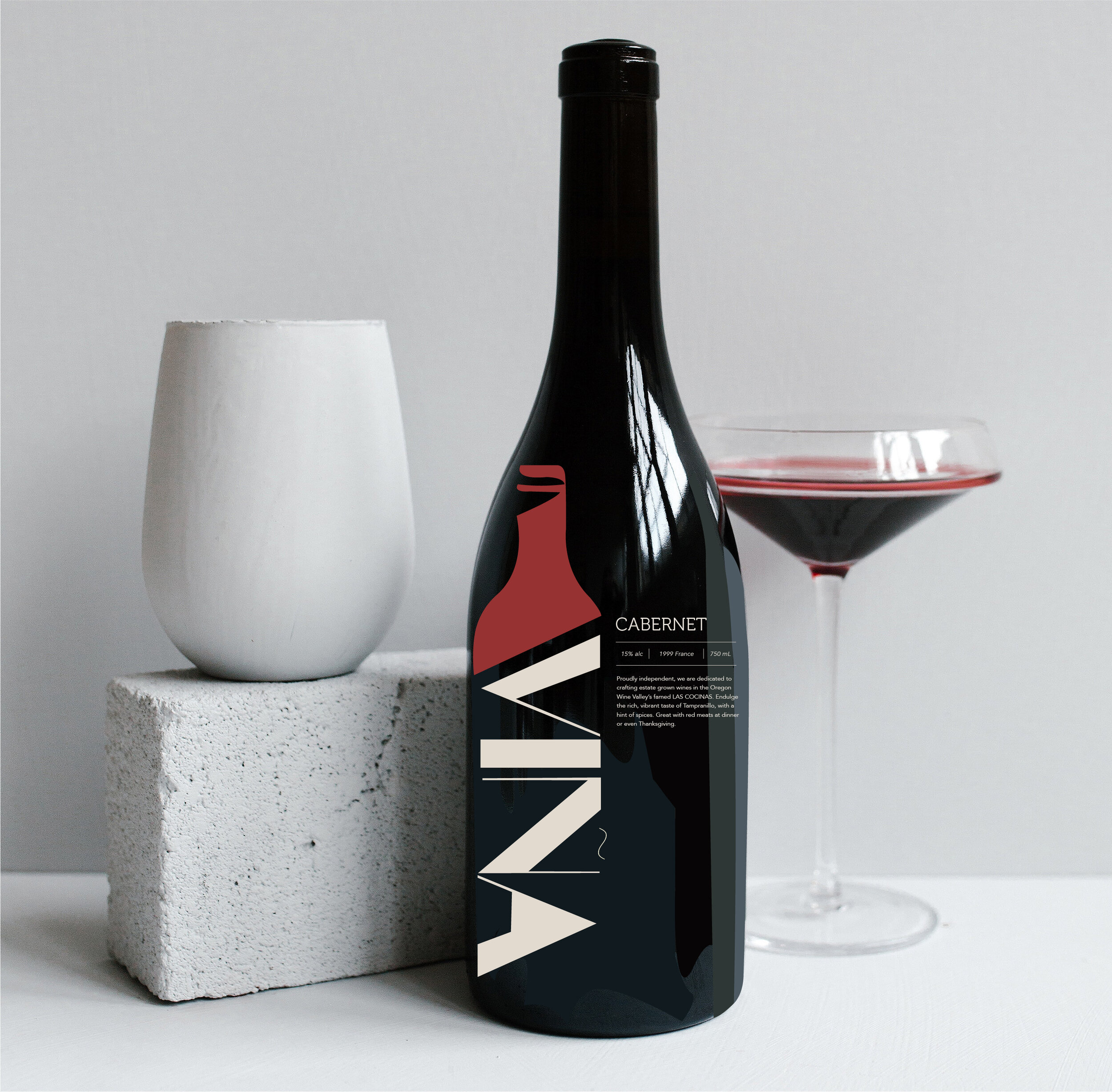
For the logo design I wanted to use the name as the brand stamp of the company but in an interesting way. I was playing around with different fonts, illustrations with bottles, and so forth. as I came to the final one, it ended up being VINA in a contemporary, elegant font that was used as the bottle part of the wine bottle then the top of it. The top of the bottle changes colors to coordinates with the wines (red, white, rose).

Color Palette
For the colors, I wanted to use traditional Spanish colors that are used within the Basq and Roija area. Rustic orange, red, and a sunflower yellow was the final picks because it was settle but made a statement. The orange was used for Rose-like wines, red was used for red wines (temperanillo, pinot, etc…), and lastly the sunflower yellow was for the white wines (Reisling, sauvignon Blanc, etc…). Black and white are also used quite a lot to still bring class and elegance to the brand as a whole, however, a soft mushroom color is used for accent for the bold colors.

Fonts
I decided to use the fonts Avenir (body), Museo (Header and Sub-Header) because I believe they compliment each other well. I wanted to stay contemporary with this because it is easy to read and follow as I was thinking about the customers’s experience. Mixing the old with the new brings a lot more creative ideas for the future of the brand and typography.
Personas
The persona i decided that would make this brand identity better and more powerful was to question and obtain information for a beautiful woman, Maria Knight. Maria is from Sevilla, Spain; she is into fashion and loves a good expensive red wine, specifically Carbnet Sauvignon. This is an important art of the process to build a targeted demographic, and be successful for starters.

Site Map
As we move forward, we set out a site map out in the function that we think would be more convenient for the user. As we create this, I was having a creative block because organizing is such a detailed oriented task, that I have to have everything perfect or I will have to start from the beginning. Doing this was education from the standpoint that this made me really dive deep into UI/UX design as a whole. Disclaimer: those colors and aesthetic are before I changed the color palette to my fine up above.
