

Washington Football Team Rebrand.
Washington Warriors.

Primary Logo.
The primary logo is based on the helmet of an ancient trojan warrior. I added the W to tie in the capital city. The idea is to play off the W of Washington and pay tribute to old team brand by staying with warrior based symbolism.

Secondary Logo.
The secondary logo’s primary use is as an accent on jerseys and merchandise. It continues to carry the warrior theme with a spear shape.

Partial Logo.
The partial logo is the flexible logo and is intended to be used on smaller parts of the Jersey and as an alternate logo on merchandise..

Wordmark.
The Word mark is the title of the team and can be used interchangeably with the partial logo. This is used on the jersey and merchandise as well as graphics.
Uniforms.
There are three uniforms designs: home, away, and a color rush jersey. For the home jersey, which is the first photo, we carry the traditional burgundy color and add accents of a warm yellow and subtle hints of white. The away jersey is a classic white jersey with bold accents of burgundy and yellow designed to be combined with traditional burgundy pants. Lastly, the Rush jerseys are a seamlessly warm yellow with strong burgundy accents. The yellow color is continued with the pants. The intention is to make the designs more fluid and yet pays tribute to the heritage of the football club. With these designs, I wanted to incorporate the logo elements created earlier of a Trojan Warrior; spears, helmet, etc. I combined the spear shape on the shoulders to make a point for the eye to be drawn towards the number and small chest logo. It was a fun project to do and allowed me to experiment with ways of integrating multiple elements of design into an overall theme. Plus, it let me work on my passion for sports..


Environmental Designs.
The Washington Warriors have decided to change their logo and team name. A new slate to design and create something more contemporary and still pay tribute to their history. This means a total redesign. New elements around the stadium and the environment, new seating, new everything. If we want to wow the public and show they fans old and new that Washington Football still worth being a fan of. I tried to carry forward the colors the attitude and the warrior theme of the past into the future. Not sure how it turned out but it was a lot of fun doing.


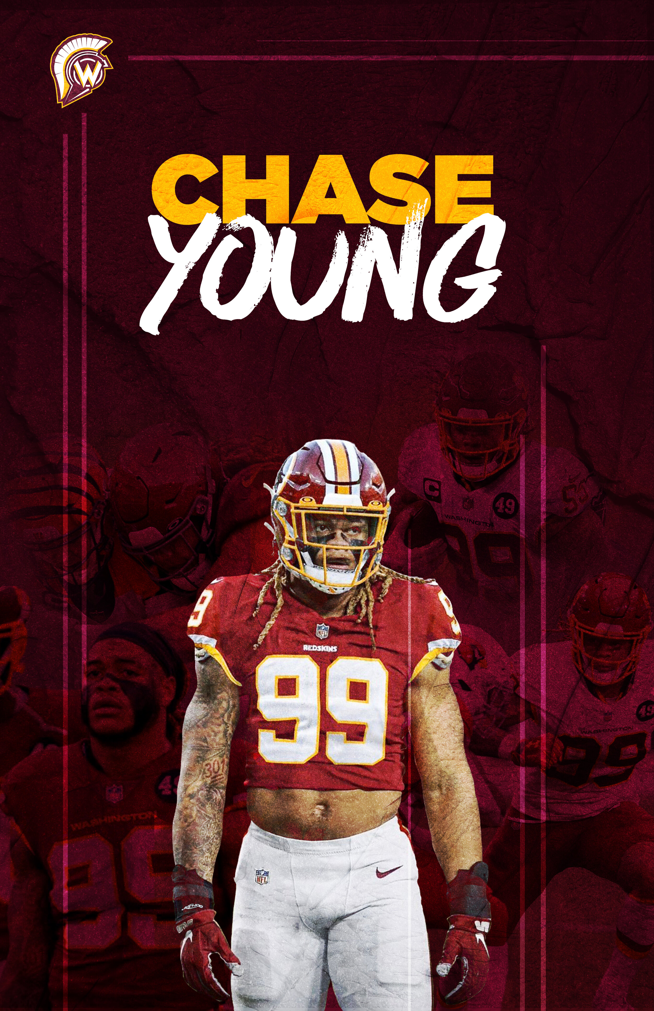
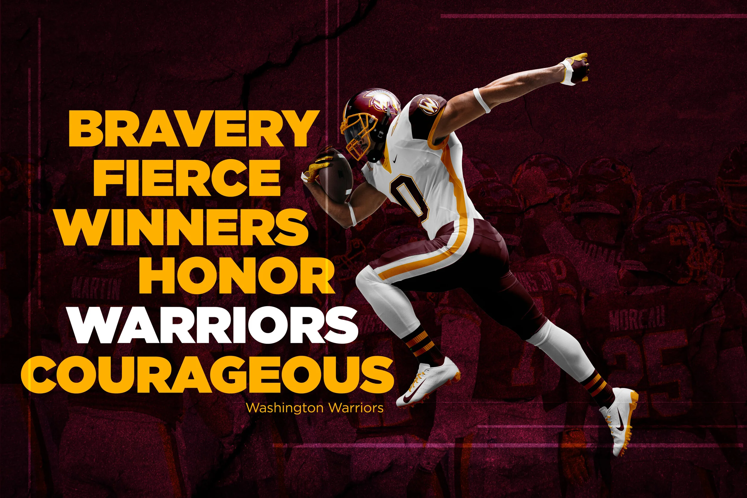
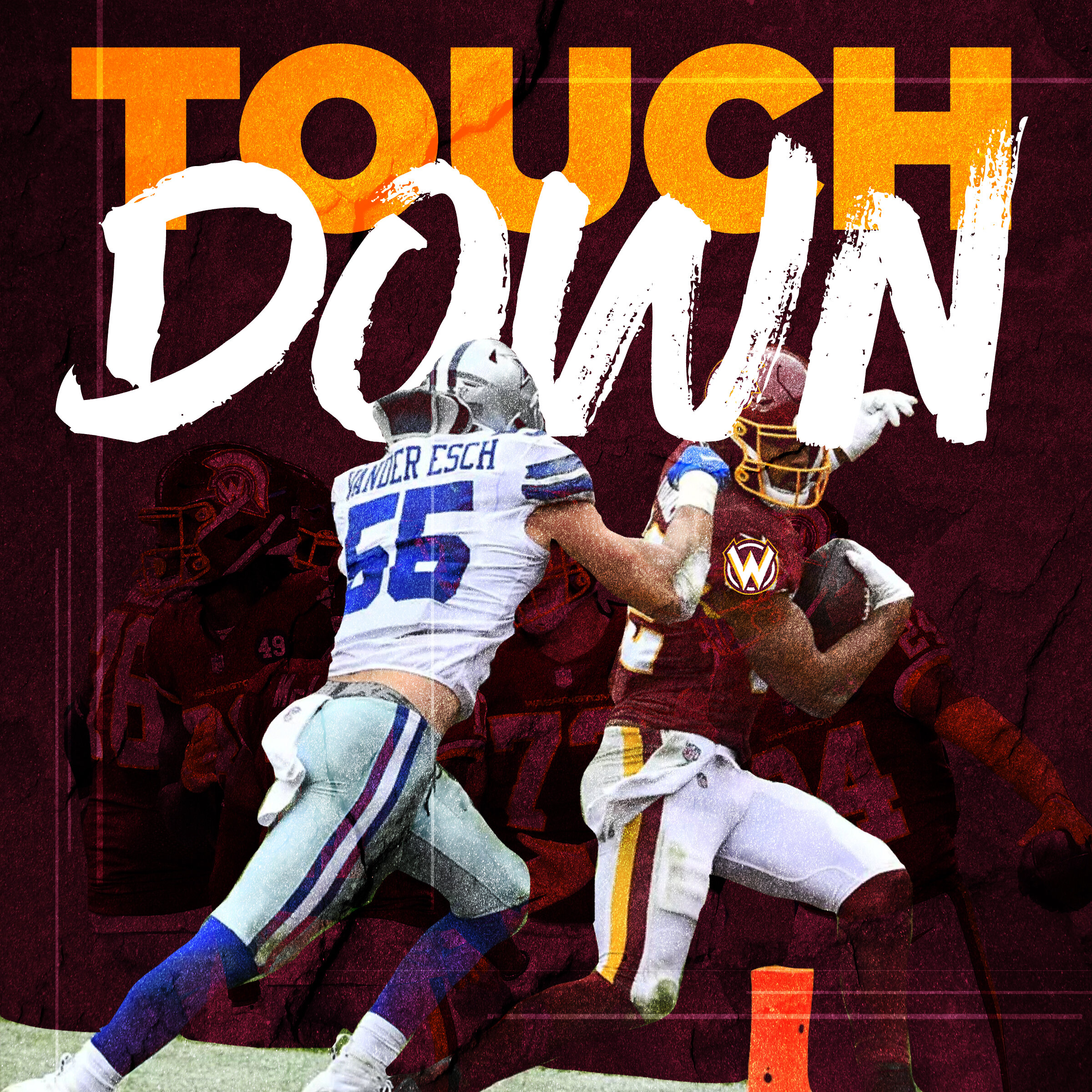
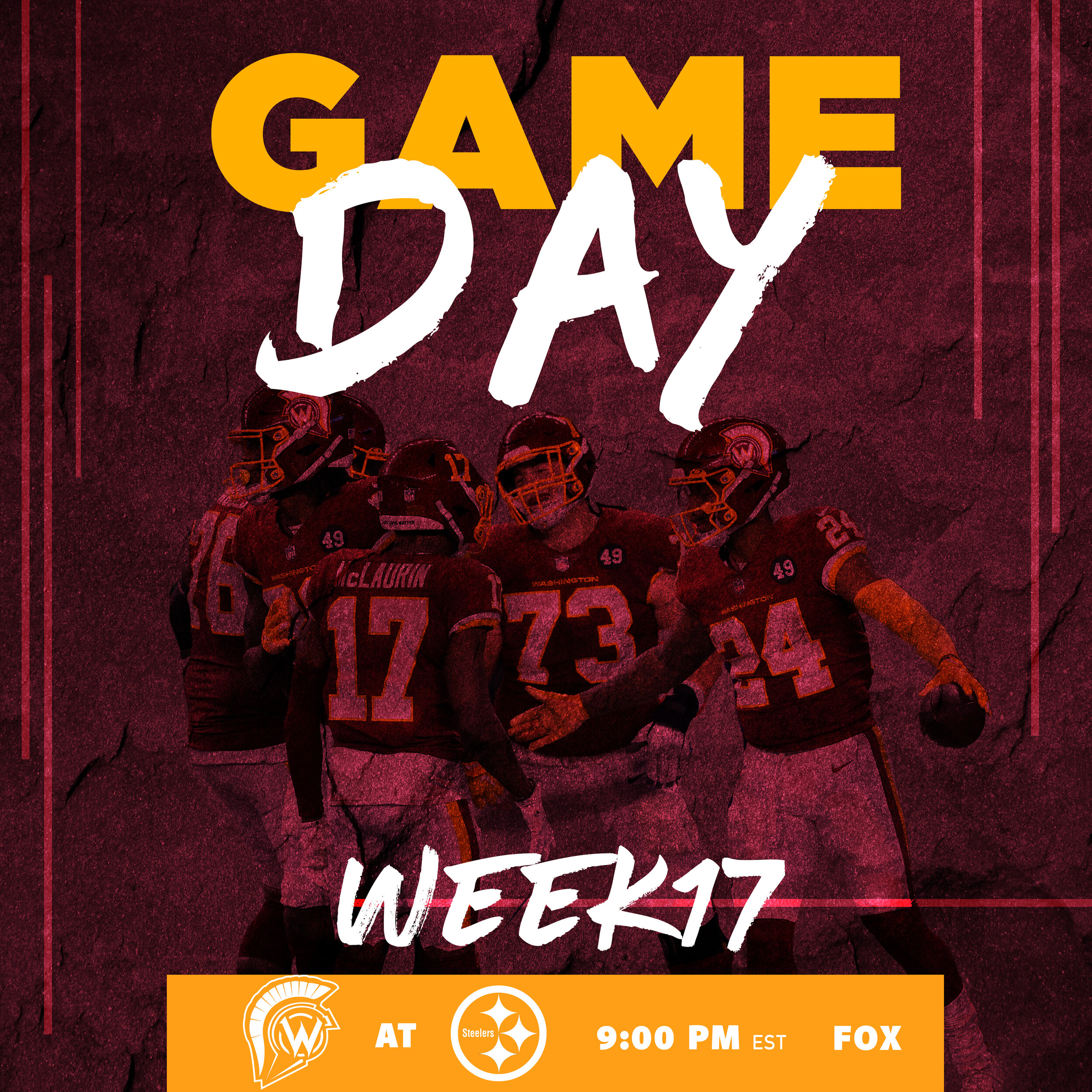
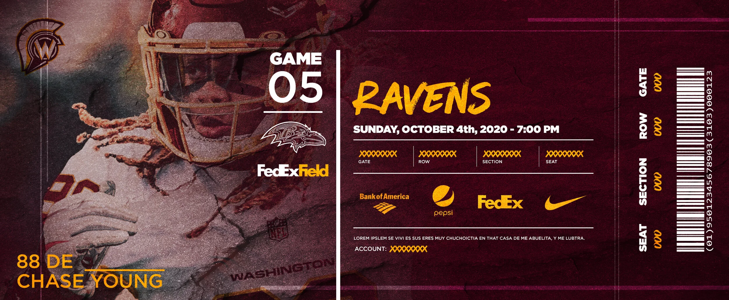
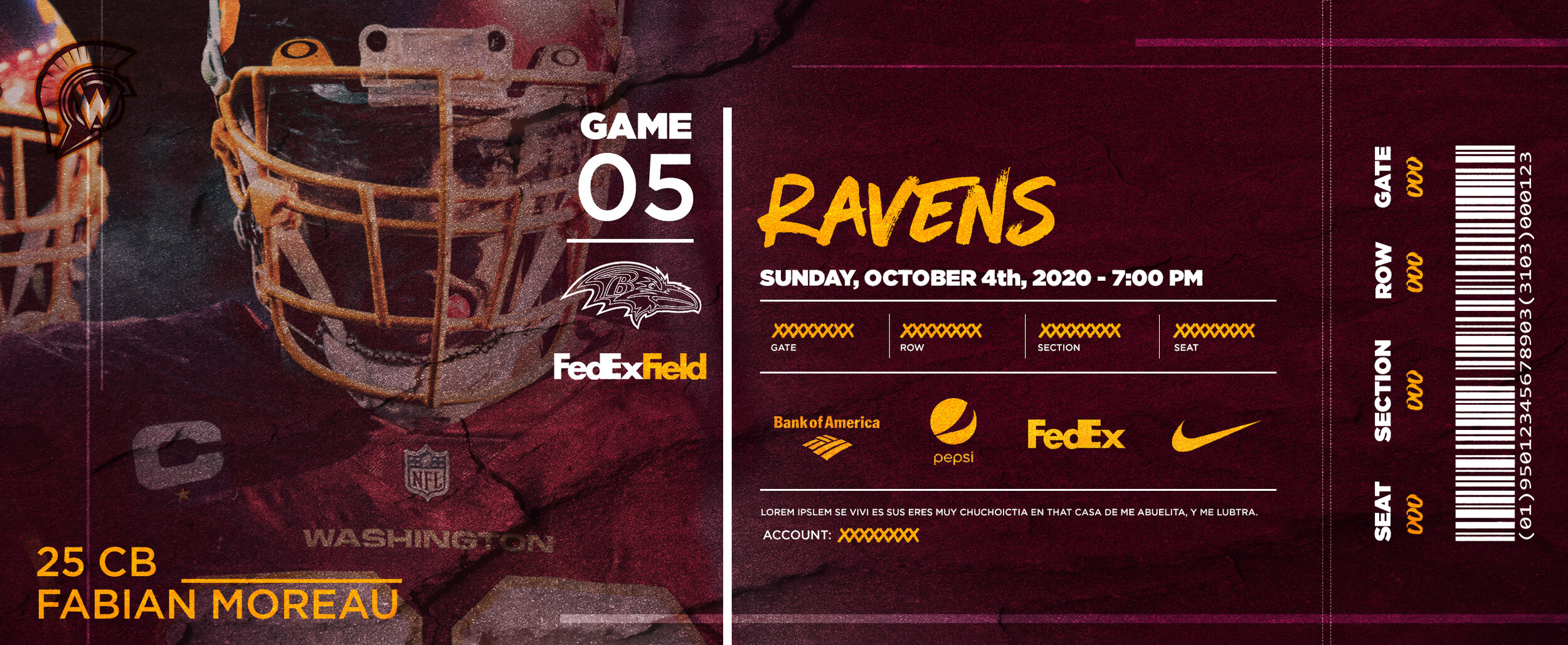
Graphics.
A fresh new start. There are all-new graphics for the team, still using elements and foundations from the old but using it innovatively. Design patterns are used to creating graphics that make the fans feel excited about their team and players. A significant wow factor plus a little fun makes it perfect wallpaper or poster material.
Merchandise.
Maintaining a cohesiveness with the rest of the brand the merchandise tastefully uses the logo elements, textures, etc. to generate cool factor and ensure loyalty to the brand..


